
In the 1820s, elegance and simplicity are characteristic of the Biedermeier era. There is a great emphasis on private activities and family life in bourgeois culture. A contented domestic life in the family home becomes a safe haven. Pseudo-realism extols ethics and morality. In order to suit contemporary ideals, fashion becomes more uncomfortable. The tendency simplification becomes apparent in typography at this time.
Clear lines and uncluttered shapes are fit for purpose in the 1920s. A free, self-confident approach to life replaces old, inhibited moral attitudes. The economy booms, cities grow rapidly. This period is characterized by bold innovations. The Bauhaus Movement sets new standards as the artistic reaction to industrial development. Cars keep growing in size and becoming more and more powerful.
In the future, time is a luxury. Premium quality materials, in economic, ecological and social terms, dominate the fashion market with its frequently changing “fast fashion” collections.
STYLE (II)
FOMALISTIC SHAPE
Project: REFER – CCO DE CONTUMIL, Porto | Portugal
Architects:Castro Calapez Arquitectos, Porto | Portugal
Construction:Cassettes suspended on bolts
Year of Completion:2008
Product: ALUCOBOND® ultramarine blue
Photos: Castro Calapez Arquitectos

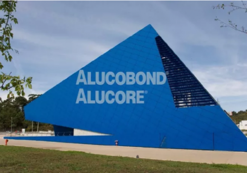
The operational control center in Contumil, Porto is a building whose modern architecture enhances the area surrounding the station. The control center building, designed by the architect, Paul Calapez, is characterized by its volumetric constitutes a striking stylistic element.

The complex seems to float above the ground due to its stereometric façade surfaces made of ALUCOBOND®. The form determines the architecture, and both color and façade grid system emphasize the form.
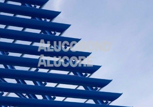
Interlocking joints refer to the networking taking place in the interior of the building. In compliance with safety regulations, the interior lay out in the sate-of-the-art control center is semicircular and this determines the center’s design isometry.
The “House of Music” in Aalborg, Denmark, was designed by the Viennese architectural studio COOP Himmelb(l)au. “The idea behind the building can already be read from the outer shape, The school embraces the concert hall,” explained Wolf D.Prix, founder of COOP Himmelb(l)au.
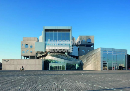
The materiality of concrete and ALUCOBOND® naturAL Brushed continues from the exterior to the interior. The seating in the orchestra and curved balconies is arranged in such a way that offers the best possible acoustics and views of the stage.
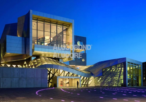
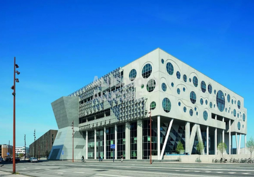
Since the concert hall has its style, the innovation city should has the style of future.
Orona IDeO – innovation city is the flagship design of the Technology Park’s new extension in San Sebastian (Basque Country, Spain). The purpose of this project is to house the company’s Innovation Ecosystem. The form of Orona ZERO is inspired by the circle, a shape which features consistently in the company’s brand image.
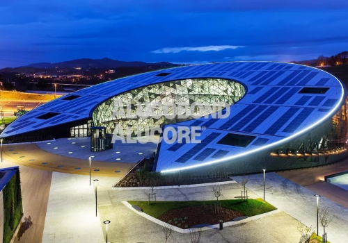
The design of the building seeks to evoke elegance, dynamics and elevation by means of an abstract formal gesture: a hollow cylinder of 90m in diameter, 16m in height and a 15°incline in height. This cylinder rises from the ground to create a 1500 m² overhang at the entrance of the city and descends on the opposite side, creating a passage way and a roof-façade for capturing power and heat for solar energy.
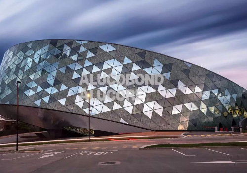
The ground plan places the workplace near the outer façade which is mainly north facing, whereas the south-facing ring-shaped gallery provides access routes and free space at the building’s center.
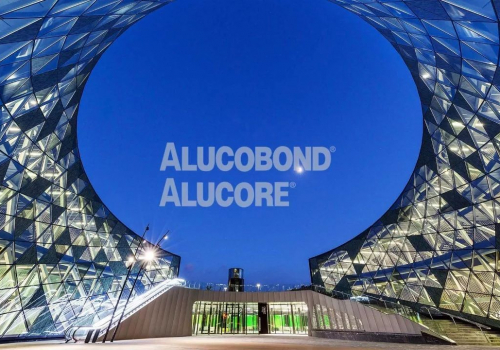
The curved façade is made up of a skin composed of more than 2000 triangular pixels, which change by means of a parametric design from: opaque, translucent and transparent, depending on the angle of incidence of the sun on the surface.
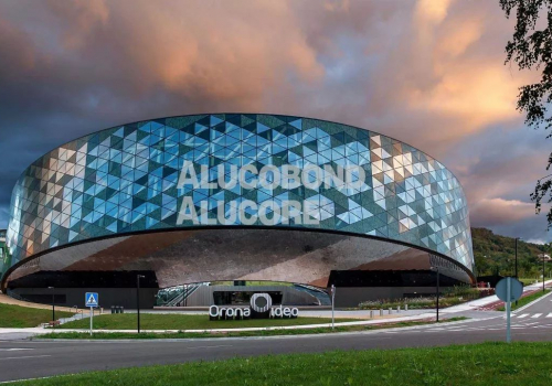
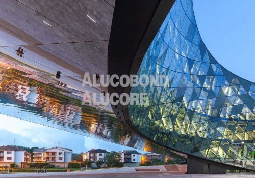
The pedestal is clad with ALUCOBOND® naturAL Reflect. It follows the parametric design of the façade and mirrors the dround. The surroundings seem to blend in with the comple
TIMELESS STRUCTURAL ELEMENTS
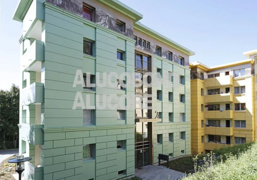
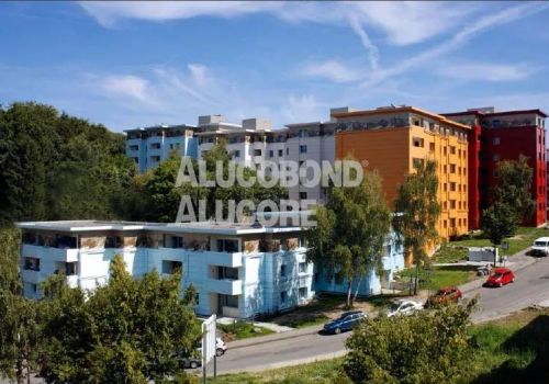
The large residential estate Höxterstrasse Hagen of the Gemeinnutzige Wohnstattengenossenschaft Hagen built in the 1970s shared the fate of many a residential sites of that time; they were considered as social hotspots and looked extremely rundown.The architecture focuses on the traditional structure and proportions, found in historic buildings in the 19th century.

△ Before
△After
Particularly worthy of mention is the mezzanine level which is decorated throughout with a picturesque mountain landscape. This is printed on ALUCOBOND®. Inspired by the mountain paintings of the artist, Edward Theodore Compton, the decorative picture relates to the hilly landscape of Hagen.
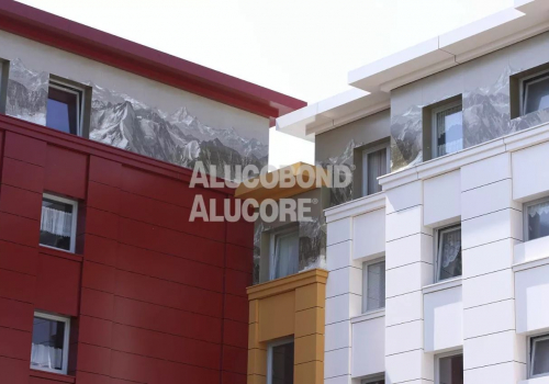
The architects were also inspired by paintings where the seventeen different colors of the buildings are concerned; the color compositions of light beige to dark red originate from the paintings of the Italian artist, Giorgio de Chirico.
